I quite like how you extended the table scrollbar to carry extra information -- akin to a minimap in code editors. At a glance it helps orient the data on screen in context of the larger dataset.
The helix I find hard to read and not useful. These types of graphs are better suited for periodic data where the period is much shorter than the span of the dataset.
The cube made me curious, but I couldn't quite see the advantage. Usually using a 3D viz is not as effective as using three 2D equivalent graphs (here would be 3 scatter plots) -- simply because the projection from 3D to 2D distorts things and messes with our innate ability to compare locations (and a bit less so, areas). What was the effect you were after here?
I'd like to think projects like these are somehow signaling a return to well designed but information dense, space saving interfaces ...
The amount of bloat, whitespace, extra spacing, "air" and other such waste - starting with (now Google-dead) "Material Design" has been egregious.-
(One can dream ...)
In my opinion this experiment is missing a key element of designing for UI density: typography.
These screens use a fixed-width font at a single size. It’s a retro 1980 text-mode UI look, and it’s fine if that was the design constraint they wanted.
But you can squeeze a lot more information on screen if you can have a proper hierarchy of typefaces and sizes.
(As a basic example, the “About” box now consumes almost a quarter of the screen on a phone. A change to a smaller proportional font could fit this information in half the space and still remain readable on a phone.)
If you look at the works of an accomplished information designer like Edward Tufte, he often obsesses about getting the typography right. His books use many typographic elements and scales even for the body text, outside of the visualizations.
Would an accurate comparison be something like perspective? (https://perspective.finos.org/)
Is the focus on density around performance, visualization, or something else?
One thing I especially like about developing data-heavy financial apps in Windows Forms is the DataGridView control. High density and high performance with filtering, sorting, and drag-and-drop column reordering and resizing. No paging required; if you want to stick 10,000 rows in there, that's fine. Most of the UIs we write are screens full of DataGridView panes. Ugly? Yes. Fast? Also yes.
My attempts to write similar UIs in React have mostly been failures due to poor performance. I resorted to bypassing React entirely for data tables in order to get acceptable render performance. Even then, I have to minimize the number of DOM elements per row so that the browser rendering itself isn't unacceptably slow.
I love information density!
I collect old newspapers and back then info density was way higher (for an _amazing_ coffee table book, google "nytimes complete front pages"). So much critical info above the fold.
I think high information density === high intelligence. Getting sort priorities right is very valuable and important.
The past few years the web seemed to be going the other way. Good to see people still rowing in the other direction.
Other examples:
I designed my blog to allow one to zoom in/zoom out to see ~20 years of posts at once (https://breckyunits.com/).
I've got some stuff coming out to promote (and make it easier to build) highly information dense cheat sheets (I'm trying to get the name "Leet Sheet" to catch on - https://pldb.io/blog/leetSheets.html)
This is interesting because it proves something to me about my vision and visual comprehension.
The "Grid" view is absolutely fine for me. The "Table" view is unworkable.
I have a lot of trouble scanning across lines like this, where I will lose which line I am on (when my glance shifts). This, I have realised, is due to the tendency to shift eye dominance slightly across to the right. (My eyes are subtly misaligned so I have some prism correction; a recent change to my prism correction has improved this situation for me.)
This particular presentation has the indicator line in the low/high column placed so that it makes this accidental row shifting (which is always upwards) even worse.
For me, the line graph would be better off either as the background to the cell, or towards the bottom of the cell. And the rows would need zebra-striping, subtly.
The lesson from me, a fast and able reader who is not vision- or cognitively-impaired is: don't assume that you can put stuff across wide lines in tables like this. Provide affordances so people can hold onto the "row" as they scan across. The keyline separators are not enough, and the hover-over background change is not usable on a touch device.
As it is, when I encounter stuff like this, I often have to un-maximise the window and reduce the window height so I can scroll and use the bottom of the window or the title bar of another one to provide a consistent "edge" to see the data on. If I am using my iPad, I have been known to use a piece of paper or card.
Some very cool looking UI elements here, but I'm also wondering what the experiment was and what conclusions you drew from it.
On sheer number of interactive elements, my experience (Svelte 4) is that the rendering usually starts to cause problems before the interactivity, i.e. you run into performance problems at the same number of elements regardless of whether they're interactive. As you implemented for the some of these pages, the solution is to go to a canvas.
That helix chart is very sexy. I'm not really sure I could use it, but danged if it isn't cool looking.
If this is an experiment, what were your conclusions?
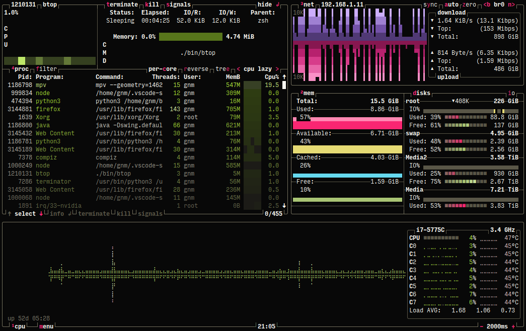
I absolutely love it, very intelligently put together. The gold standard for this in the terminal is btop. Check it out if you’re into this sort of thing:
Example: https://terminalroot.com.br/assets/img/cpp/btop.png
I love this -- dense but still easy to read.
Also beautiful and polished as a piece of design, apart from the dataviz.
One thing we may still haven't realised is that UI designs are subject to fashion cycles, just like clothing. Except enough time hasn't elapsed for us to observe a full cycle similar to peak-bell-bottoms or peak-low-riders or peak-sideburns. We may be in a low-contrast / low-density peak, but we won't know until we pass it. However, looking back, we did seem to have passed at least one peak-skeuomorphic cycle (remember all the toolbars, icons, drawers and Microsoft Bob?). We may see another high contrast monochrome text-heavy cycle yet.
https://static.crowdwave.link/index.html
Above is the evidence that react can handle this sort of thing just fine.
I hacked/converted the page in question to React to show something similar.
Its randomly generating updates to the table and then resorting the table and repeating.
You can grab the source here but I warn you it's hacked together in less than an hour:
Reminiscent of the Bloomberg Terminal: https://en.wikipedia.org/wiki/Bloomberg_Terminal
Having to support mobile throws a big wrench in all design. You suddenly have to worry about a very different viewport and now you’re significantly limited or designing two UIs.
On mobile, if I zoom out to 85% everything gets smaller and more things fit on the screen (great!). Zooming out further to 75% makes everything larger... 50% and things get larger still (more so than they were at their default size at 100%).
The layout works remarkably well on mobile regardless, but I wasn't expecting such unintuitive zoom behaviour.
Is there a code repo for this site? I can't seem to see one, and I'm curious to see the svelte source.
DAWs and video editing programs can be very information dense.
Reminds me of the Tron Legacy boardroom scene UI!
I’m curious about what the objective and conclusion is. Admittedly I’m in the “less technical” audience, so less focused on the “sexiness” (as I’ve heard others refer to it).
Well done. Tables are very dense, still easy to read. Proof that information hidden behind empty screens with tons of blank space has never been the way to go.
I see you took a page out of the Bloomberg Terminal.
Love the cube view! Tangentially related - anyone know a linux tool which takes a bunch of points/lines/labels as input and generates a nice interactive 3d view of it? I've considered using .obj file viewers, but it doesn't quite hit the mark. Gnuplot is nicer but doesn't have interactive features as far as I can tell.
That Helix reminded me of this old game
https://en.wikipedia.org/wiki/Tempest_(video_game)
except it really is a helix and not a cylinder like a Tempest level. Still would be fun to fight bugs in.
Adding a tiny bit of Y-padding made this a lot more readable for me. I wish more information display interfaces offered these kinds of controls. A thought that occurs to me: does densely-packed data get more readable the more experience you have with the data in question?
This is great work.
The mini-map/scrub view in the table seems to suspend the drag motion if you target outside that vertical element with the mouse. Intuitively I would assume it would just let you drag until mouse release.
I'm in the final release phase of an app that I have developed over the last month, but it builds on a test app that I wrote, a couple of months ago, and that had multiple screens, showing tabular data, in various forms (and ways to sort and filter said data). Fairly similar process to this, but on a more humble scale.
I tested for a while, settled on one form, and made an app for that.
It's not the most exciting variant, but it seems to work very well, and the reception in the public beta has been quite positive (one problem is that it's not an app that I would use, personally, so I had to rely a lot on the feedback of others).
I love this, specially the minimap idea on the table. Have you considered a different way of adding/removing/moving columns with too many columns (100+)?
There's a company in Iceland called "CCP" that did a similar interface. They call it "Eve Online"
I've heard that the DX with Svelte is among the best out of all web libraries/frameworks. Curious how it went creating this UI.
This is slick. Does anyone have recommendations for high density real world maps with tracks like FlightRadar or similar do?
This is surprisingly fast. A really impressive showcase of the design philosophy of Svelte. Even loads and renders fast on mobile!
DOM Loaded: 134ms
FCP/FP: 163ms
LCP: 218ms
TTI: 1826ms
This obviously does not fit "as much data on a screen as possible". My laptop has a 7.7 megapixel display and each pixel has 1 billion possible states. This page is putting maybe 10000 bits of information on the screen, not even scratching the surface of machine's capacity.
the helical visualization is a new one for me and very nice, tho I agree with previous commenter about its usability, mainly bc of having to zoom in and out. really nice interaction tho
You could make it far far denser than this
the experiment fails pretty hard on my phone where i have js turned off by default :p
It's a thing of beauty
Love it
Love this. Amazing work.
That is just amazing!
meta: I would have upvoted this post 2x if you did the backend in Rust.
svelte 4 is handsdown the best framework out there. I really am disappointed svelte5 is turning into react-ish framework. That was the main reason I used svelte was because it was NOT react.
Low UI density is the new emperor's clothes in modern UI design. It's being actively promoted by companies in order to cut design costs, but the truth is that it's only reasonable on touch interfaces or casual apps.
Mouse interfaces are fundamentally different, because you have much more pointing precision, so it pays off to show more data on the screen. You don't have to cram your interface with with spaces to make it scan-friendly, you just use heterogeneous elements and colors. Look at Blender and you'll know it can be done.
I'm designing a desktop reference manager (https://getcahier.com), and one of its aims is to provide a UI with high information density. The mobile version will be able to adjust the experience, replacing desktop-only interaction patterns with mobile ones, and the UI elements that are shared will be somewhat bigger, so that users are able to interact them with touch.
Apart from that, it seems that the whole industry is confused regarding UI styles. UI frameworks are either favoring touch interfaces and degrading the experience on desktop, or vice-versa. Even Windows 10 released certain parts of the control panel with desktop look and feel and others with touch-friendly but desktop-antagonistic screens. It's time we realize that both platforms are different and we shouldn't degrade one in favor of the other.
I work have built some dense UI for certain types of fixed income (bonds and swaps) trading, looking to move it all to svelte because react cannot handle the quantities of data (and if even if it could the code is unbelievably ugly).
Something I've been banging on about for a while is the following: Programmers and designers keep trying to rebuild instagram in every domain, pretty UIs, regular UIs, "simple" UIs.
This is great when every interaction might be an onboarding, but can be really limiting and stupid in an environment where people are actually paying attention.
A proxy I like to use for the above distinction is whether the users are paid more than the programmers
cool.
I appreciate that you are using this idea, but keeping padding and other design in tact, unlike most linux/unix devs that like dense ui.
An infinite scroll would have more UI density.
Or a rich text editor containing 200 pages of text.
I'm guessing it's an experiment on whether it's possible to make a human nauseous with a UI.
This a flashback to the DOS era for me, or CLI utils like 'top'. I can't quite express why, but I find it a bit ugly and vaguely annoying. Probably reminds me too much of unstyled spreadsheets, or maybe I've just been brainwashed by modern trends...
Regardless, I guess my primary gripe with it is the cognitive overload. A bunch of numbers (stocks? not sure) and names that all look the same, sometimes with different color end digits (why is the zero gray sometimes), in a vast sea of information but no context. What is the most important item at any given time? What do I need to pay attention to? I mostly just glaze over and tune it out because there's way too much going on.
I get that it's an experiment (and ultimately a preference). Just not my thing, I guess.
I deal with a lot of data in tabular form, and I like to have as much of it in front of me at once as I can. The biggest influence on my report design has been, believe it or not, iTunes: no more padding than necessary, zebra striping, fast and easy sorting, and something like a column browser if possible. I've been using DataTables happily for years.
One thing I've been experimenting with lately is sorting vs. showing. If I'm pulling data from Jira, and an issue is blocked, do I need a separate boolean column to sort or filter, or is it enough to style another column (say, age)? In a table with a hundred or more rows, will an orange, red, or bold red value in a single cell stand out enough for me to recognize something I need to address now?
Looking at the table view of this experiment, the things I like are:
* live updating
* stable sorting for multiple columns
* row highlight on hover
* dimming the trailing zeros
* colors aren't overdone; basically just three pairs of colors
* graph in the 24H Low/High column, kind of like a sparkline
The things that don't land as well with me:
* horizontal scroll bar is almost invisible
* the wide vertical scroll bar with the graph
* how does 24H Low/High actually sort?
* no filtering (although it may not be essential for this data source)
The other thing I notice, comparing this to some of my own reports, is that there isn't much variance in the width of the values. It's harder to manage column widths with text than a bunch of numbers.